Project Scope - Redesign an existing festival logo and create a style guide for the new branding. Incorporate a full-color logo, black and white logo, new brand colors, and set of brand standards and guidelines.
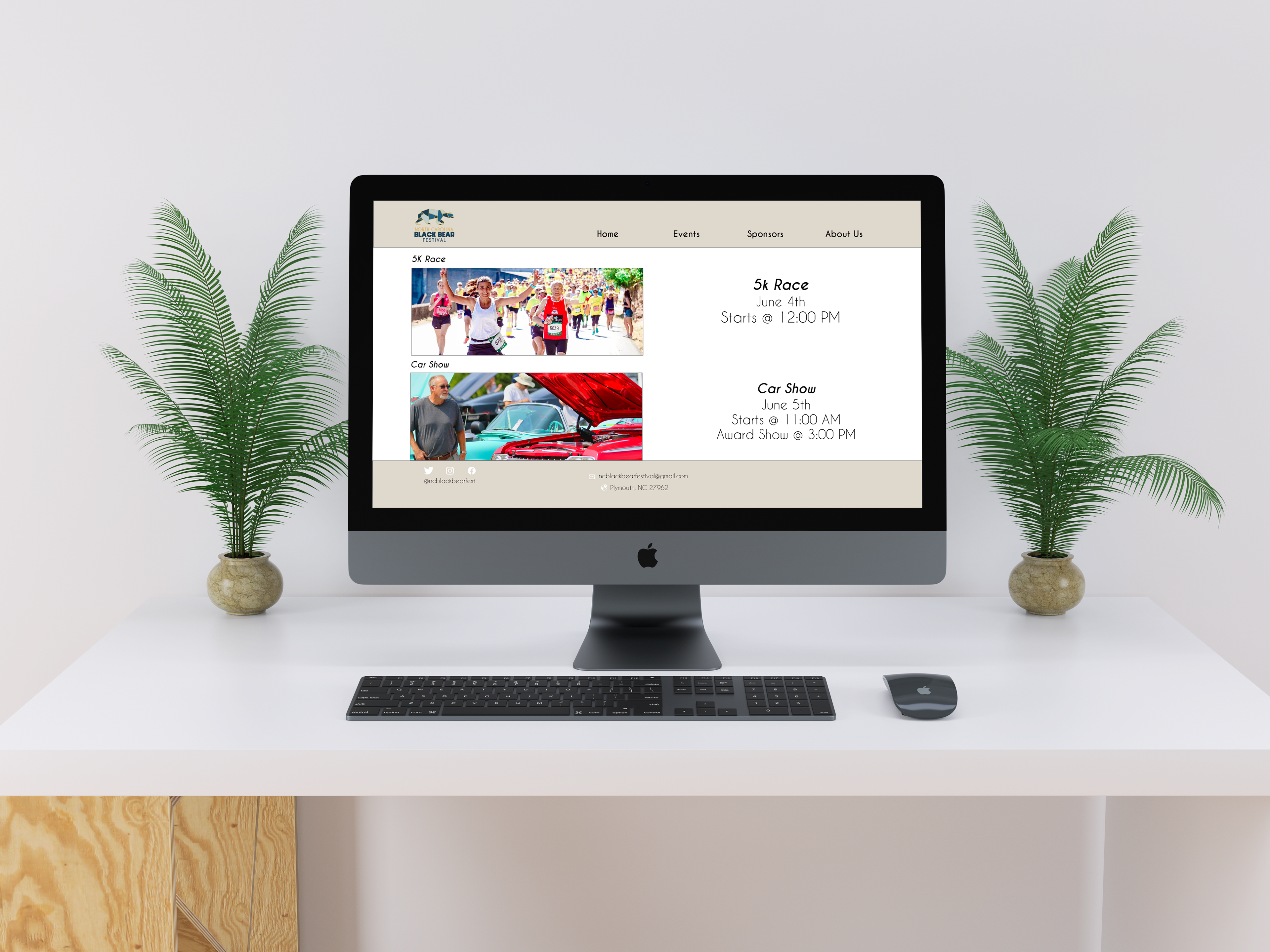
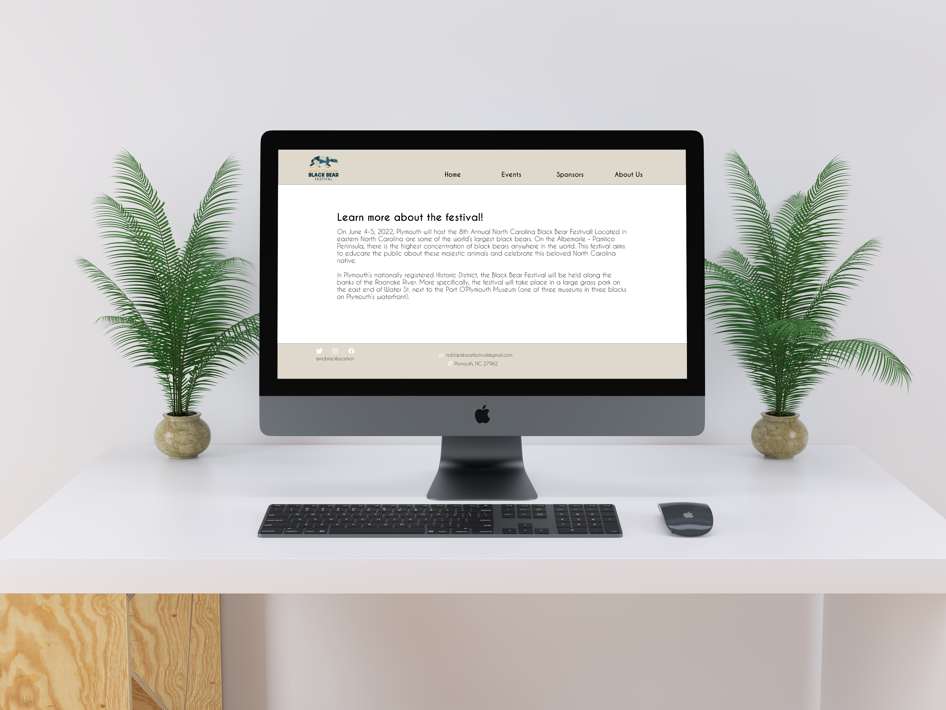
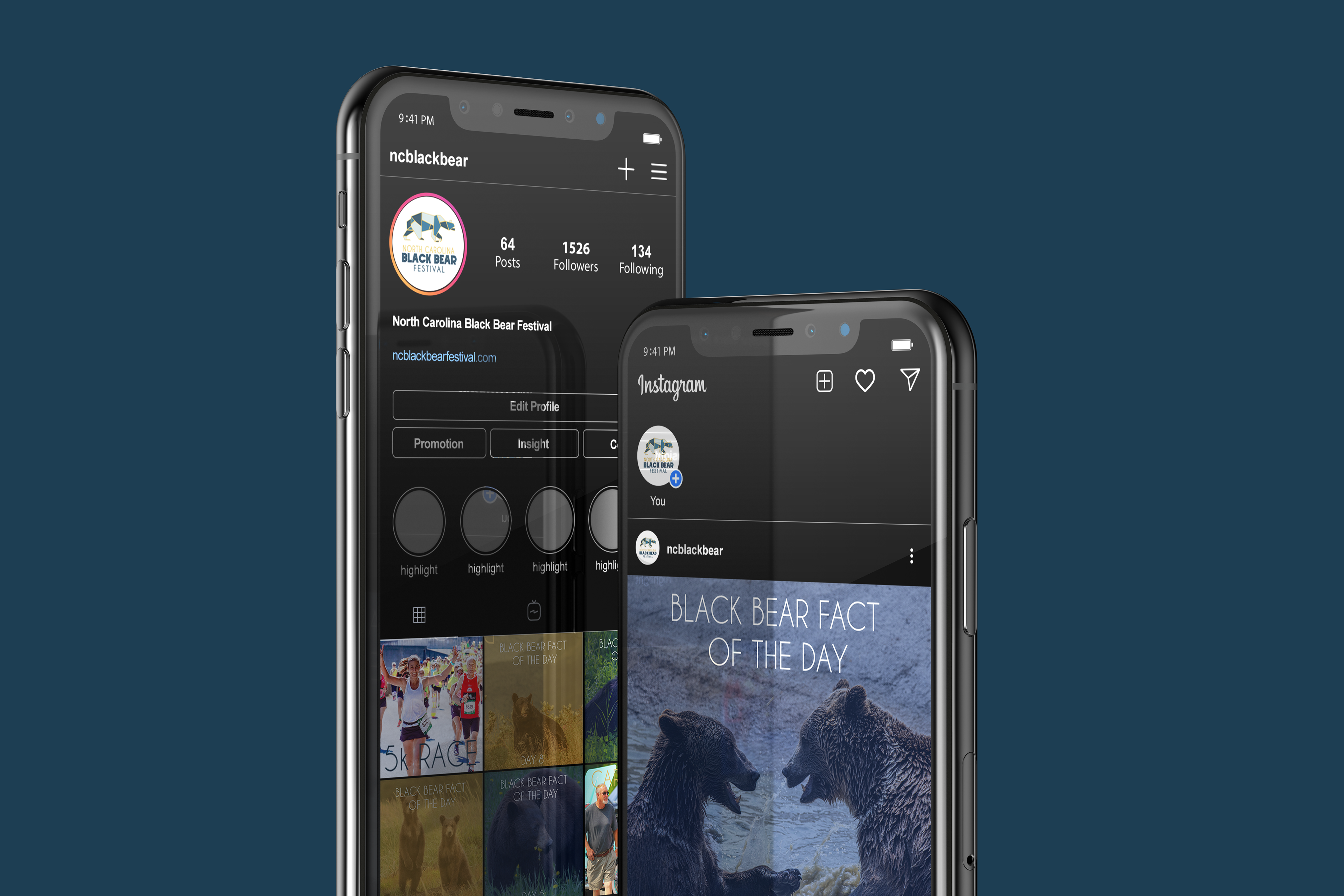
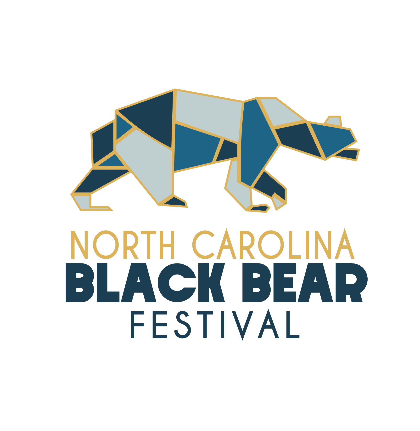
NC Black Bear Festival – For this project, I had to rebrand and create a print and digital strategy for promoting an event in North Carolina. This festival is a way to celebrate the biggest Black Bears in North Carolina and is also a way for those that come to the festival to learn about them. For the second part of the project, I defined our events and established the target audience. Step three was a visual research document and stylized personas. During this step, I created a mood board of the event and how I wanted the event to be like. After working on the mood board, I started my thumbnail ideation for the festival’s logo. I made 10 thumbnails for the logo mark and the logotype. Logomark is the image in the logo, where the logotype is a font that is being used in the logo. I picked two typefaces for the logotype. I used Caviar Dreams for the words “North Carolina” and “Festival.” Then I picked the typeface Crystal Lake for the words “Black Bear.” I picked Crystal Lake as a typeface because it is a big bold typeface just like a bear is. For the logo mark, I draw a silhouette of a bear. After doing a couple more thumbnails, I added geometric shapes to build the bear. After doing thumbnails, I scanned them into adobe illustrator to start the digital roughs. For the color palette of this logo, I went with three shades of blue and gold for the strokes. I wanted to have a coastal color palette so it can fit the location of the festival. For my style guild, I used 12 pages. The style guild is used to see how the logo is supposed to be